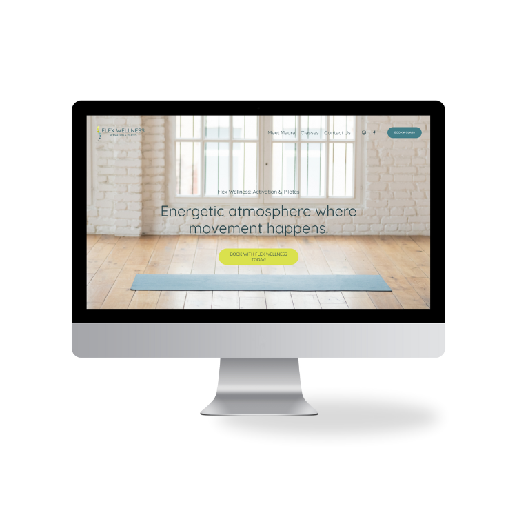
an energetic atmosphere where movement happens.
flex wellness
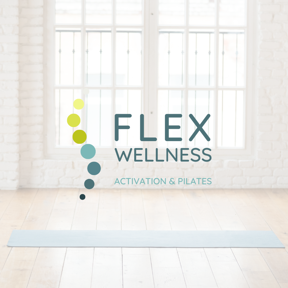
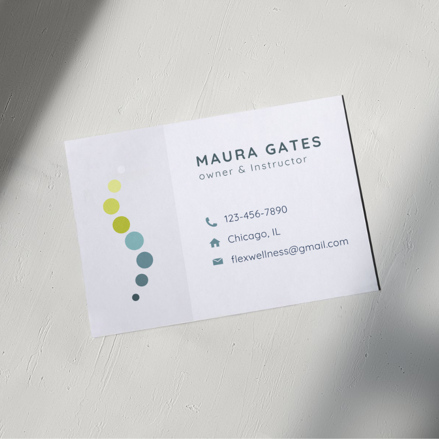
We designed the Flex Wellness brand with a focus on energy, movement, and wellness. The dots in the logo are thoughtfully arranged to resemble a spine, symbolizing strength, flexibility, and alignment. This flowing, upward path of dots visually encourages movement, inviting clients to embrace growth and progress in their wellness journey. The clean, open design of the website complements this theme, creating an airy, motivating space where clients feel inspired to connect with their bodies and nurture their health in a vibrant, supportive atmosphere.
our services
- Branding & Logo Design
- Web Design
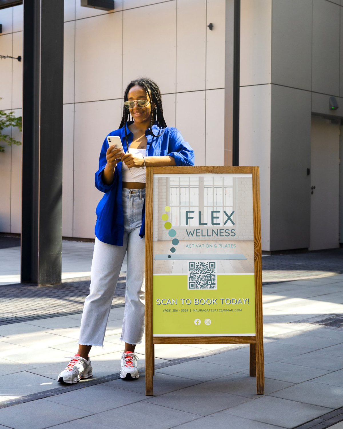
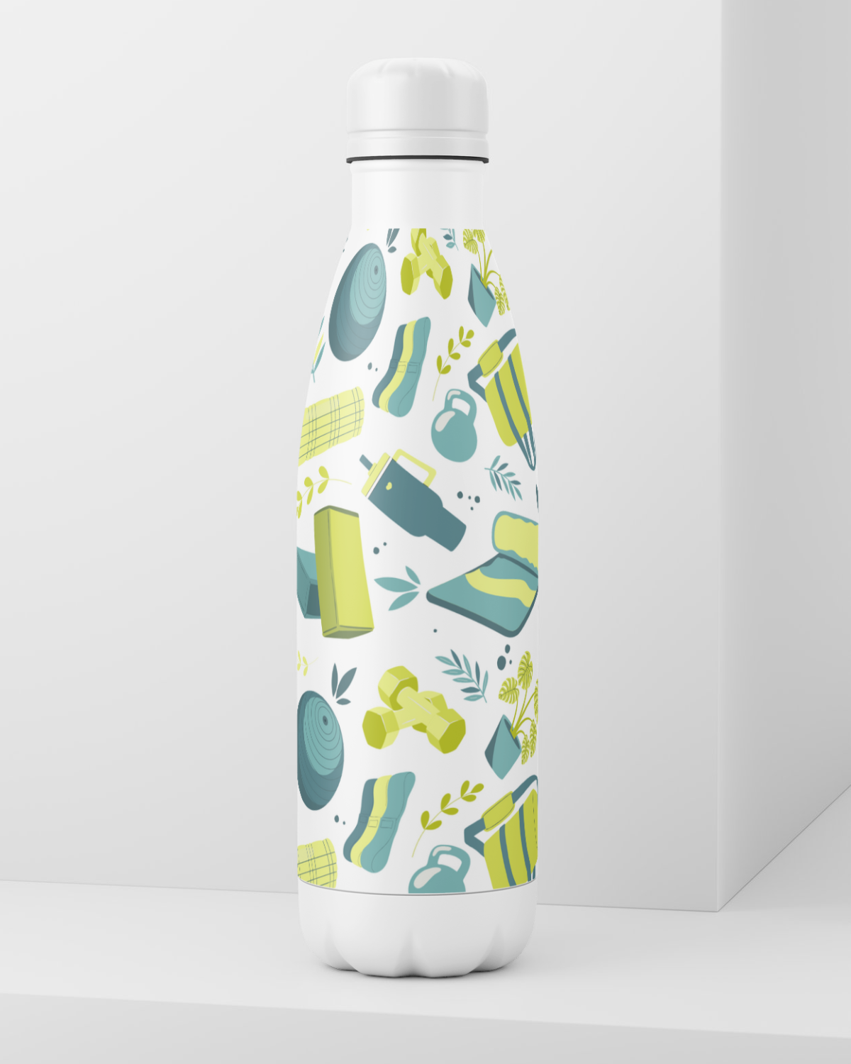
- Marketing Design - merchandise, signage, flyers



“Reilly was a joy to work with! I have recently opened a brick and mortar Wellness studio and needed a website design to cater to my needs. Reilly was the perfect professional to accomplish this important task! Knowledgeable and creative in every aspect, while being patient with my basic questions! Reilly goes above and beyond for her clients and always in a timely matter! I could not have done this without her skill set!”
— Maura G., Owner & Instructor

